Signal AI
Junior Designer at Signal AI - a tech company using augmented intelligence for decision making - London & New York.
Brand Identity - Social Campaigns - Event Design - Collateral - Slide Deck Design
Social Media Campaign
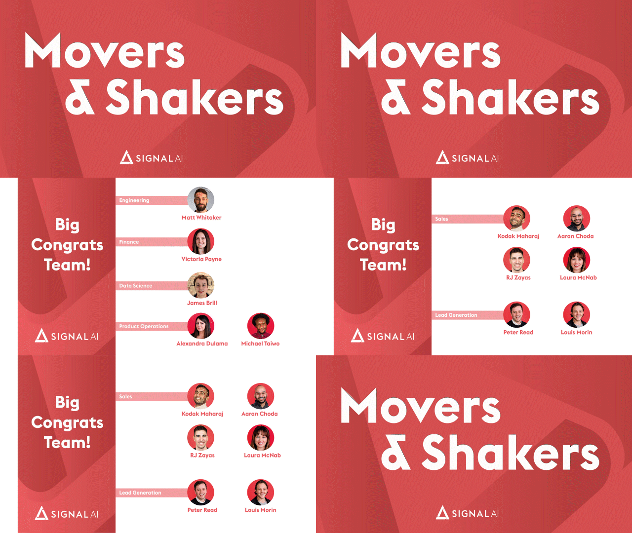
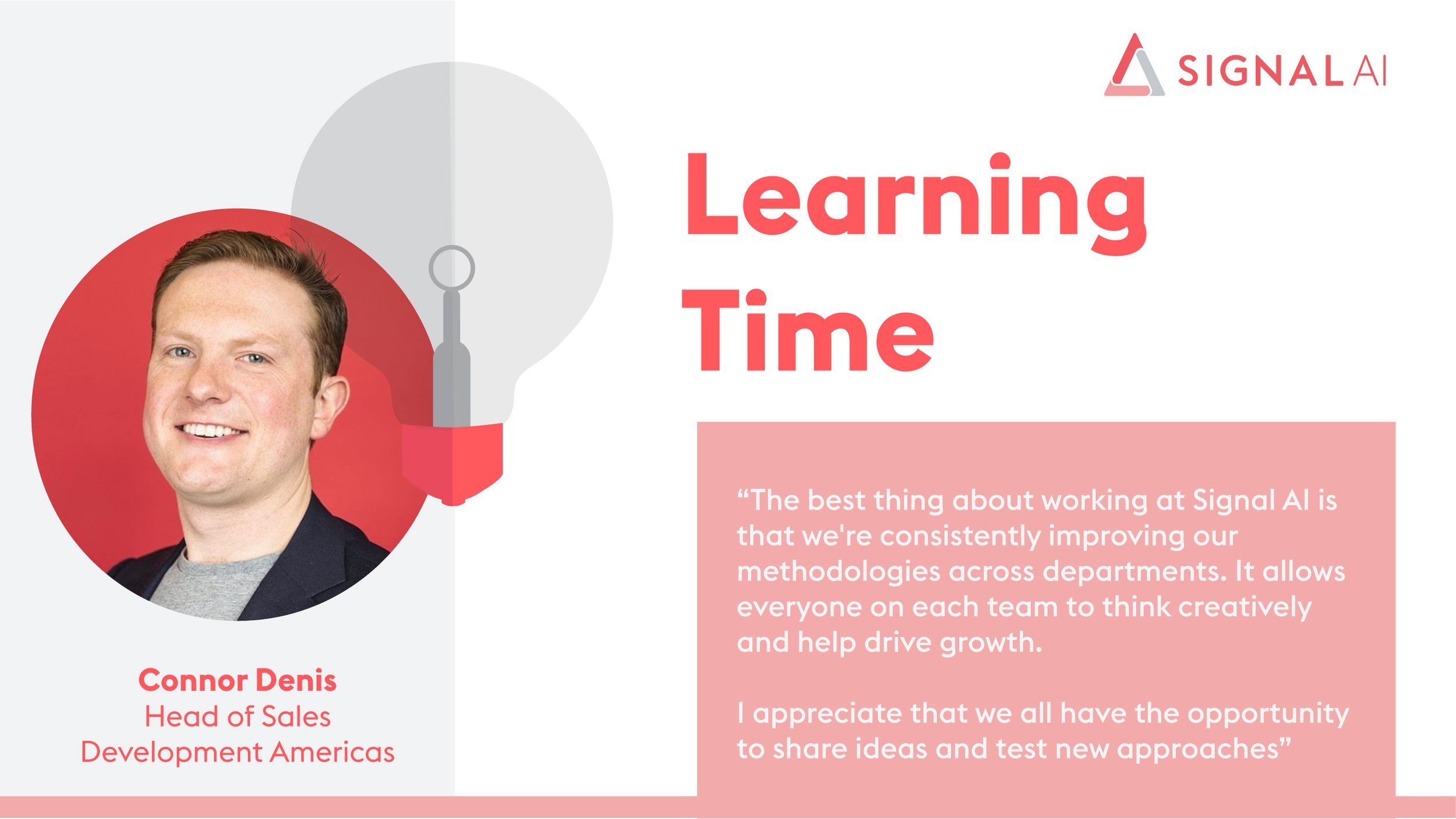
During a time where the world was starting to reach a somewhat norm after a global pandemic, Signal AI took this chance and worked on a Social Media Strategy to hire and attract new talent. Through using the Signal AI pyramid along with fresh new gradients based off our colour scheme, I created a range of social media posts which highlighted on our values and perks of working with us.



Event Branding & Design
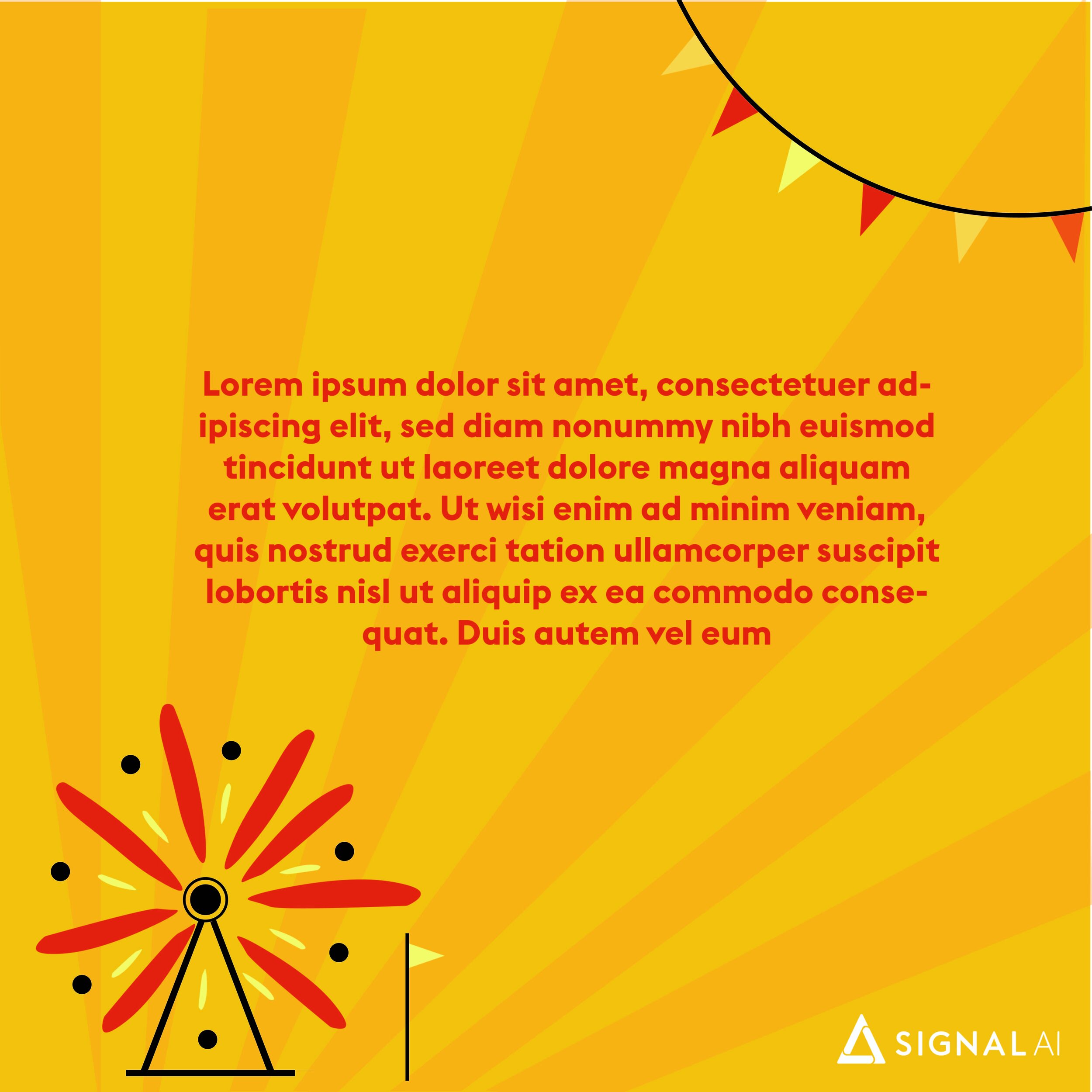
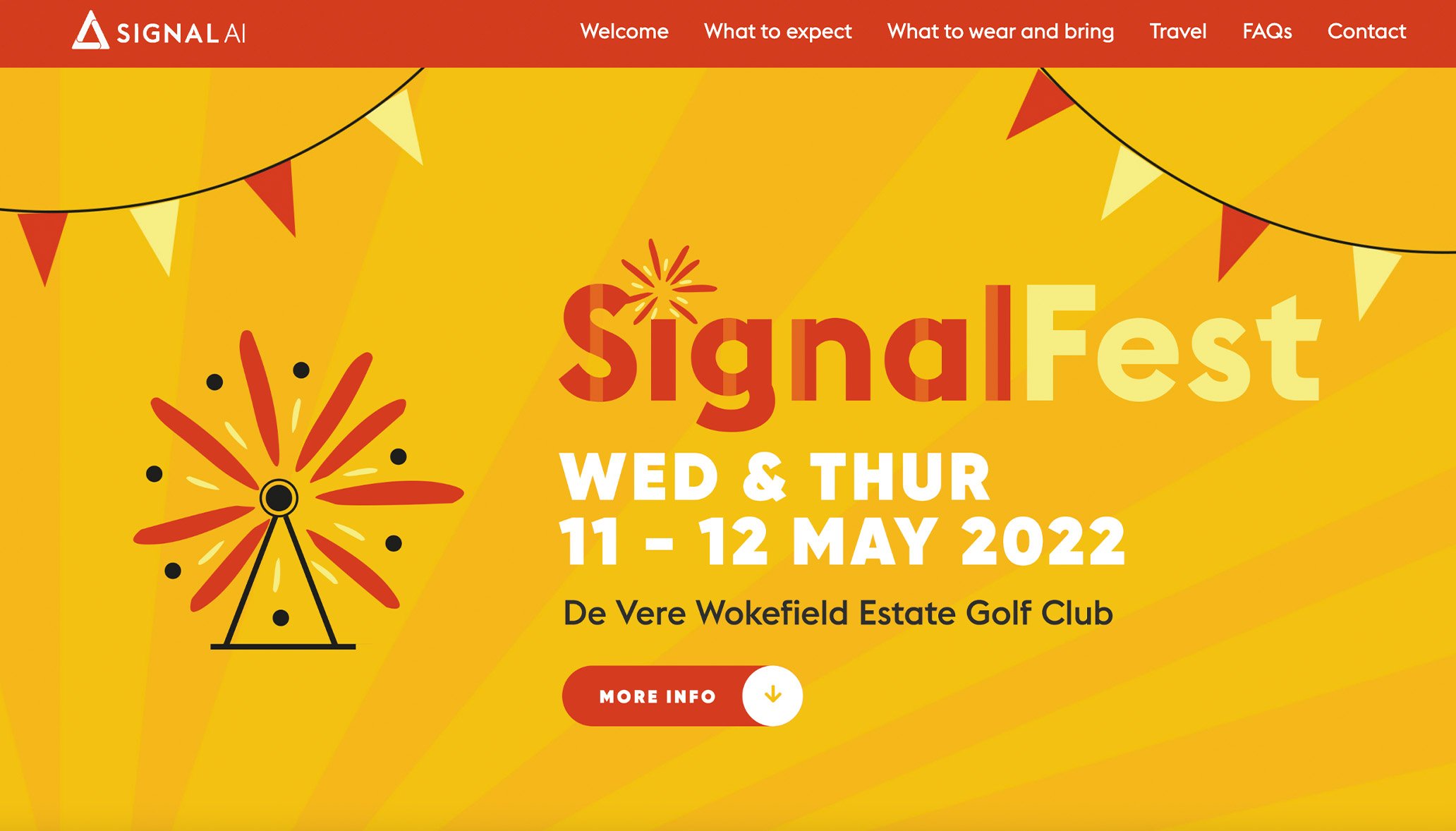
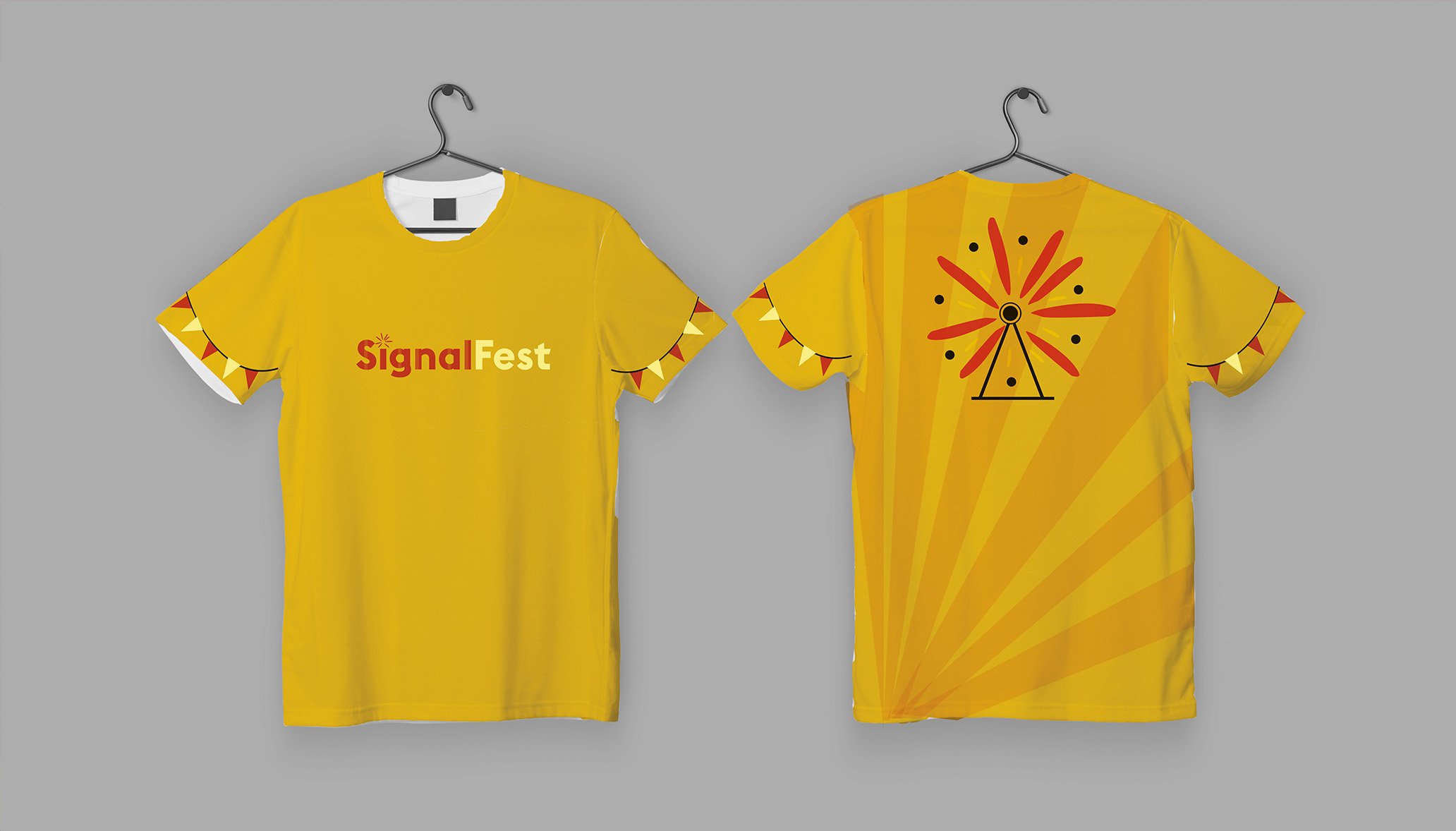
What was after an almost 2 year hiatus for Signal AI in person events, we started the year off strong with the SignalFest offsite, a chance for both the New York and London office to reconnect and reboot in festival style. The branding being bright and carnivalesque to mark the start of a new strategy for our company.
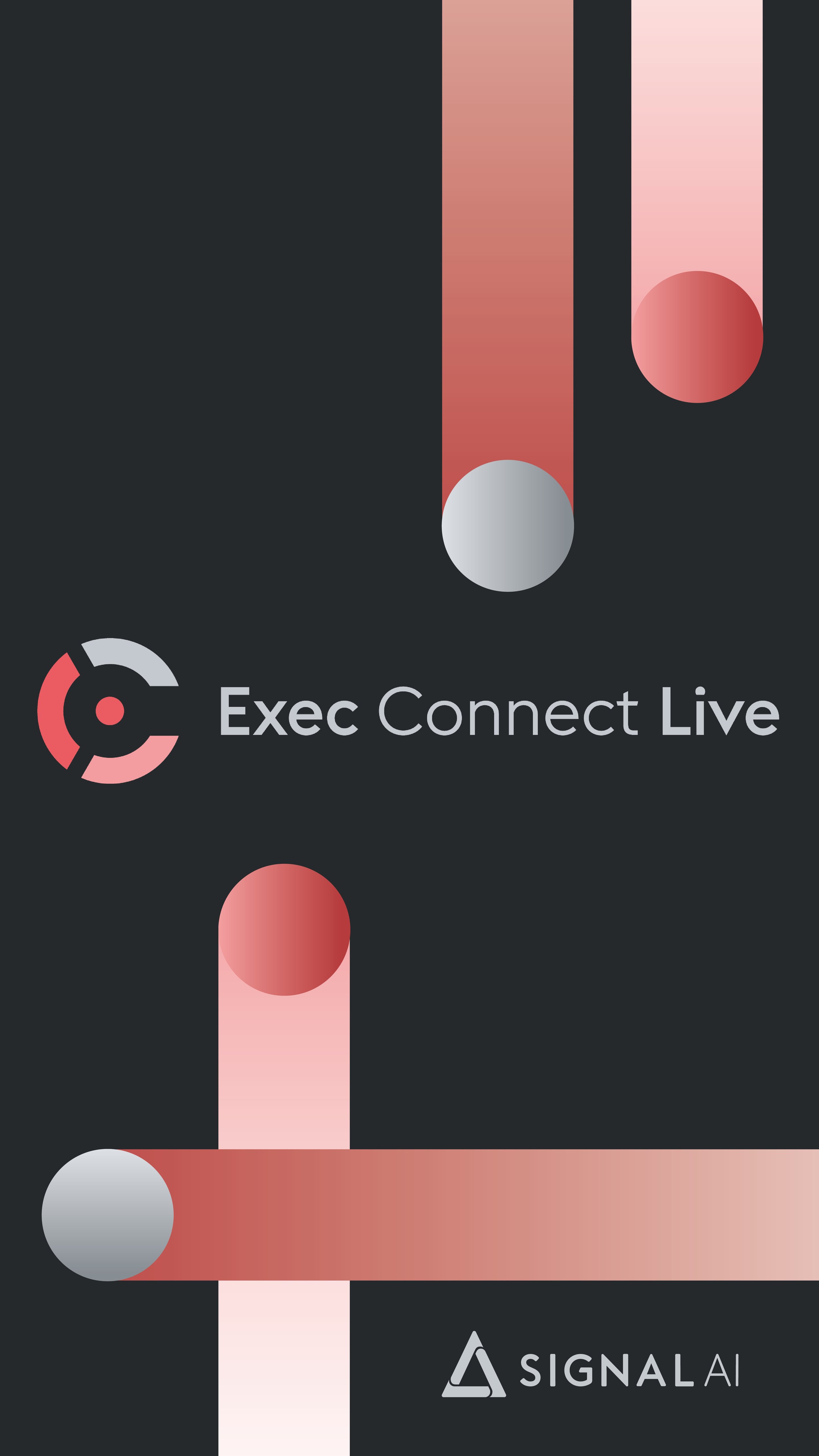
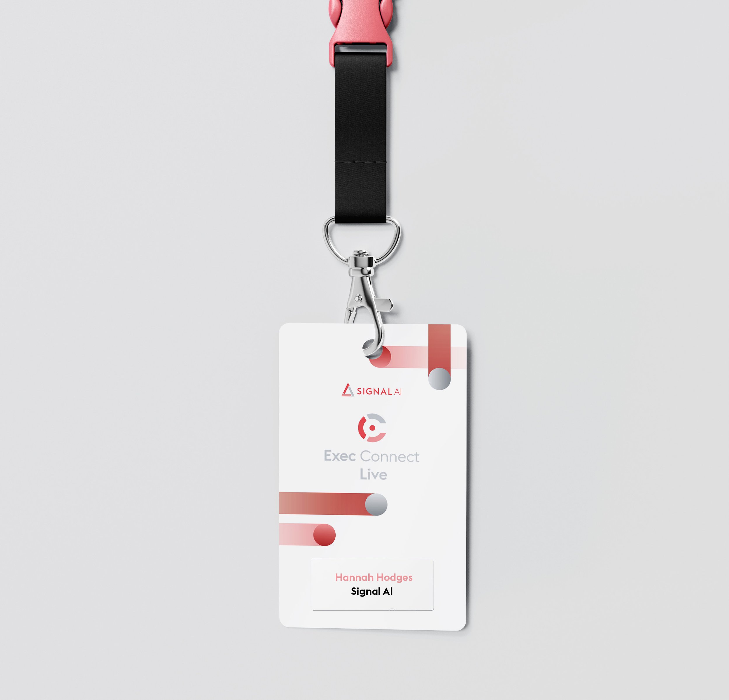
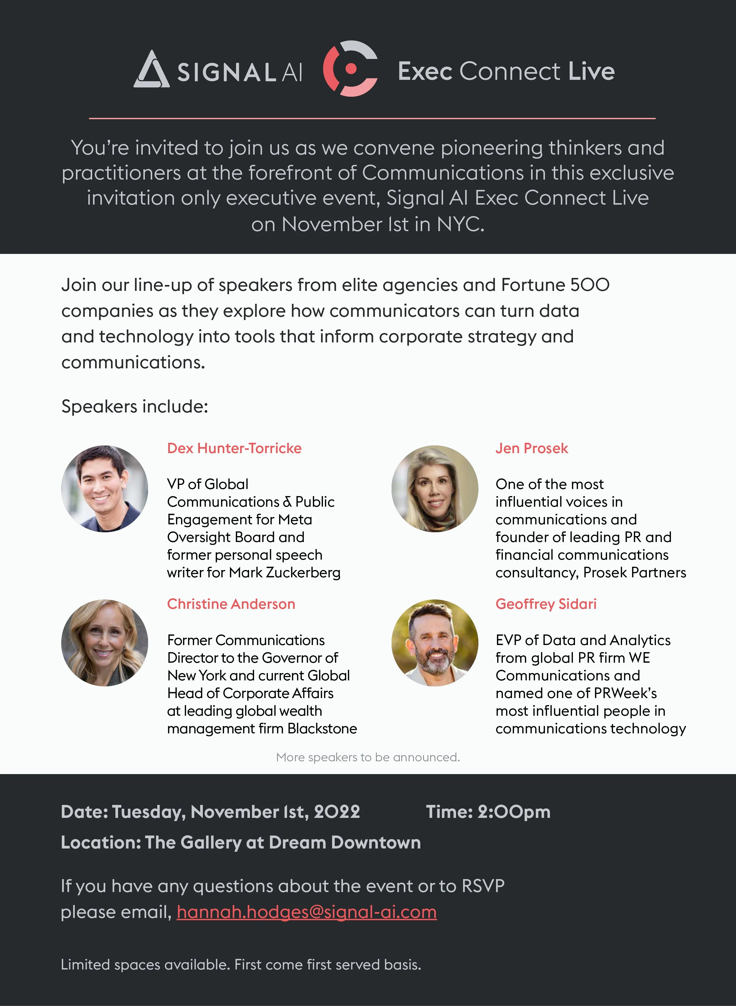
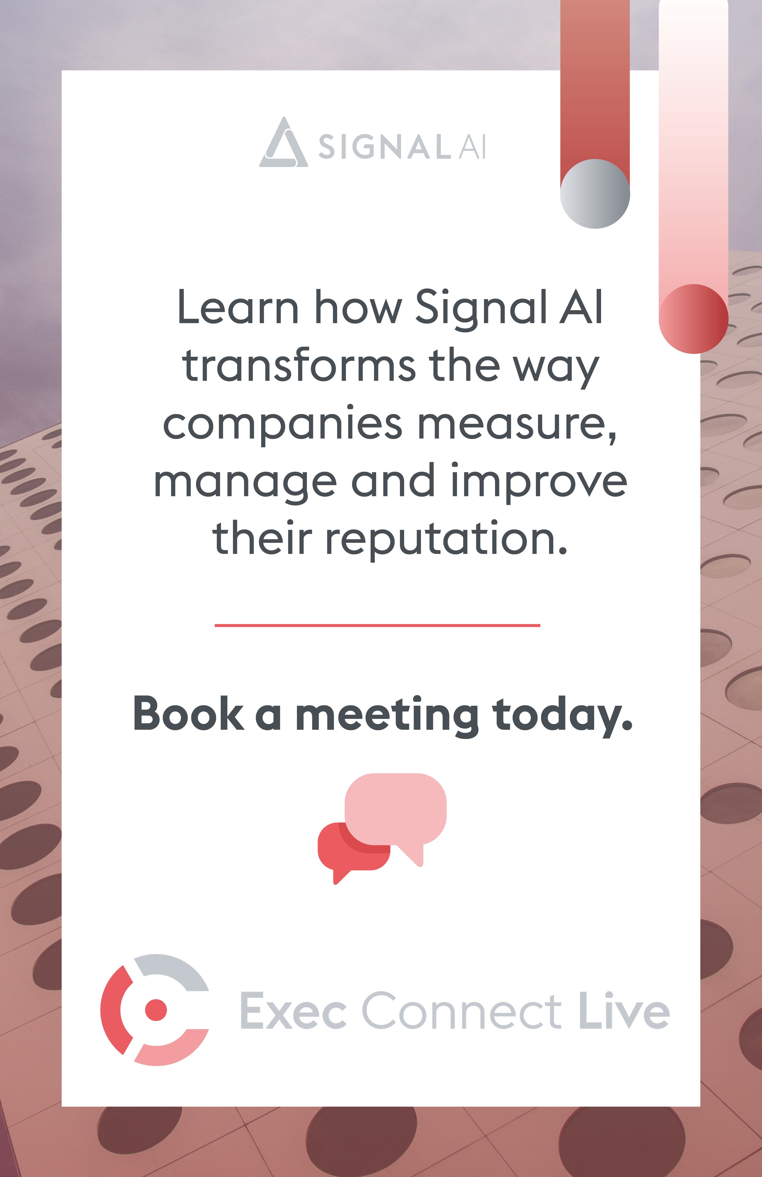
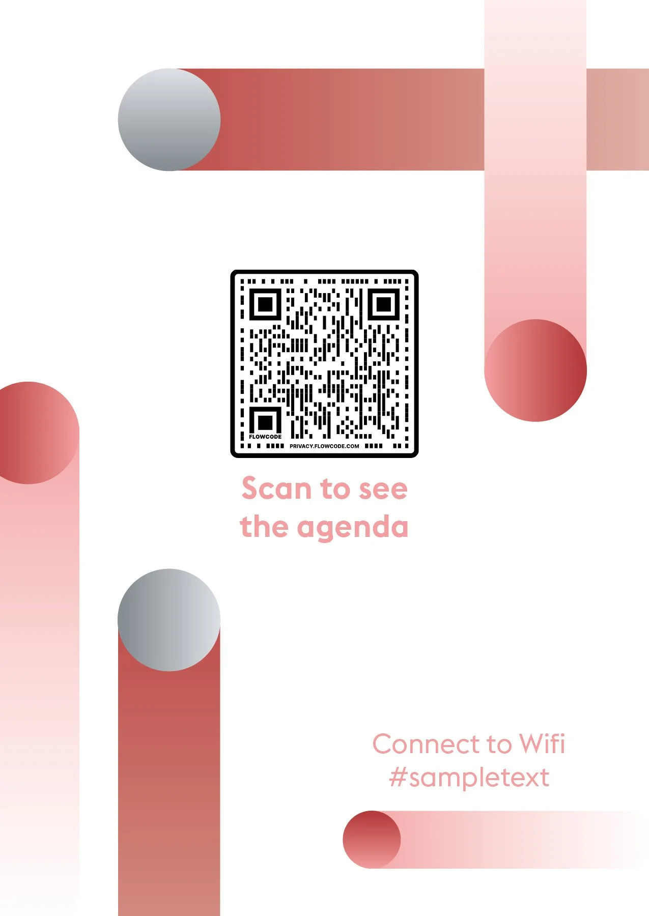
The Signal AI Executive Connect Live was a bigger and more executive extension of our previous Exec Connect event. This one being a larger platform and space to facilitate speakers and attendees from the Fortune 500 to connect with new ideas and people. Sleek new gradients and circular shapes are used to represent the interconnectivity that the event facilitated.
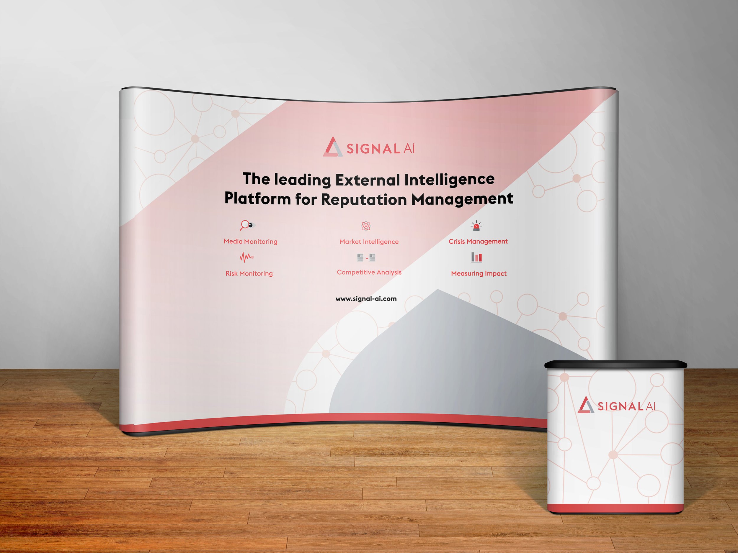
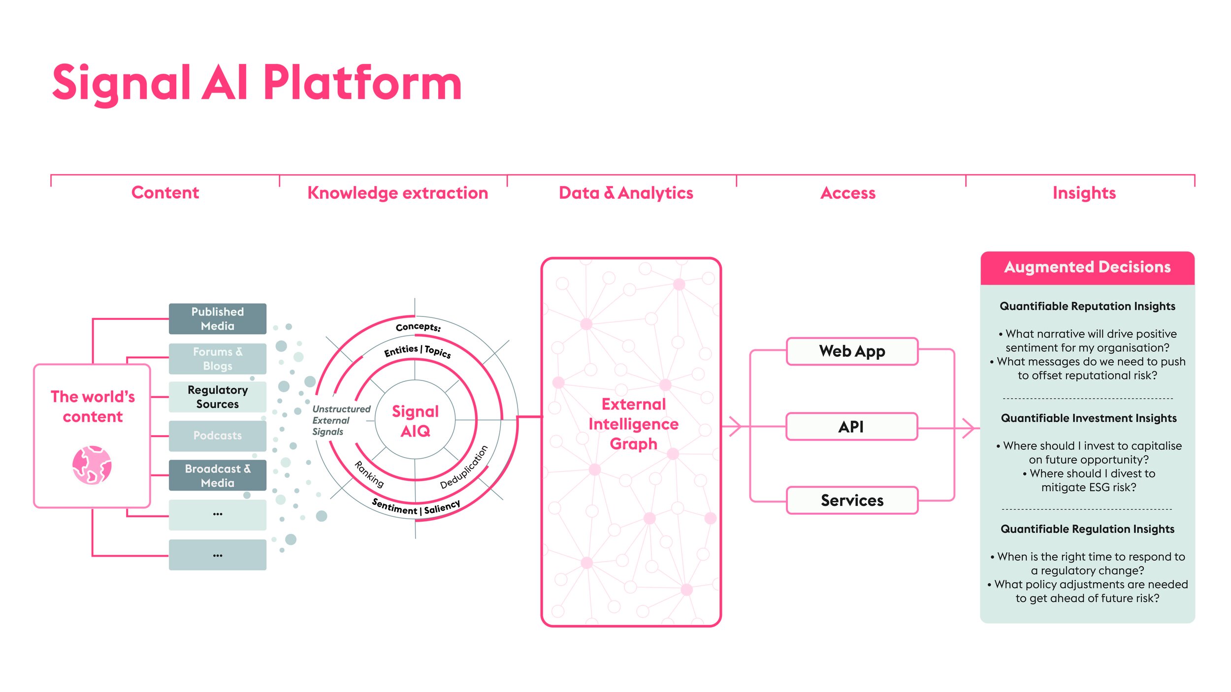
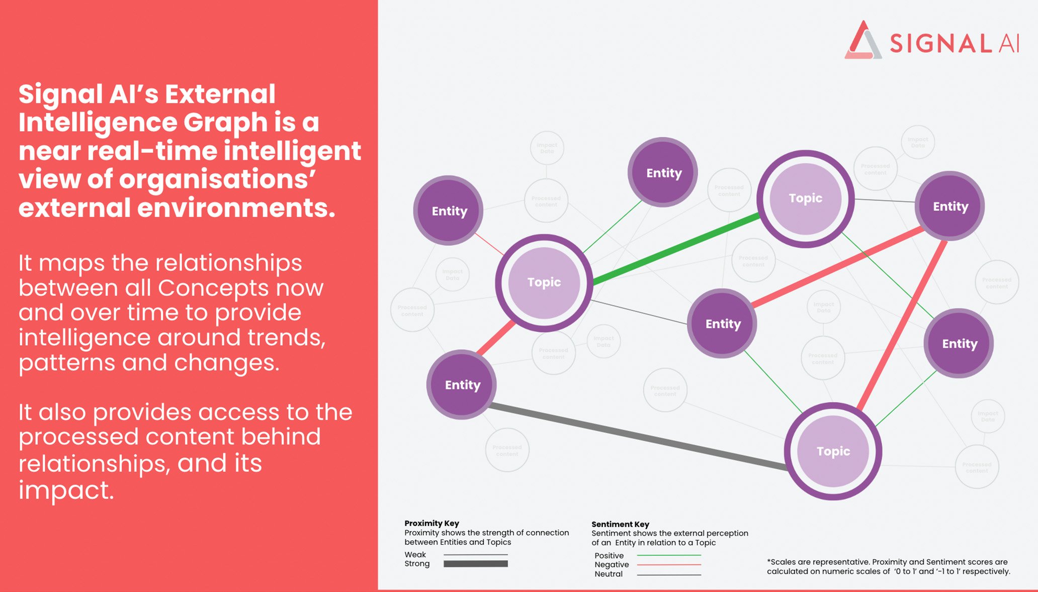
Lastly, our External Intelligence launch made for a new way to reposition ourselves and our strategy as a company. New assets such as the External Intelligence Graph and our Blueprint Design were created to be staples and foundations of how we would be viewed as an emerging Tech company.
SignalFest



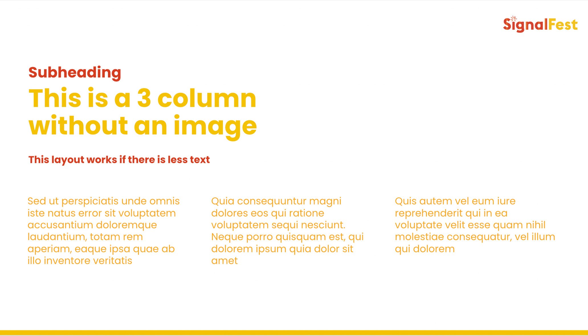
Master Deck Template


Signal AI Executive Connect Live






Signal AI External Intelligence Launch

Report & Collateral Design
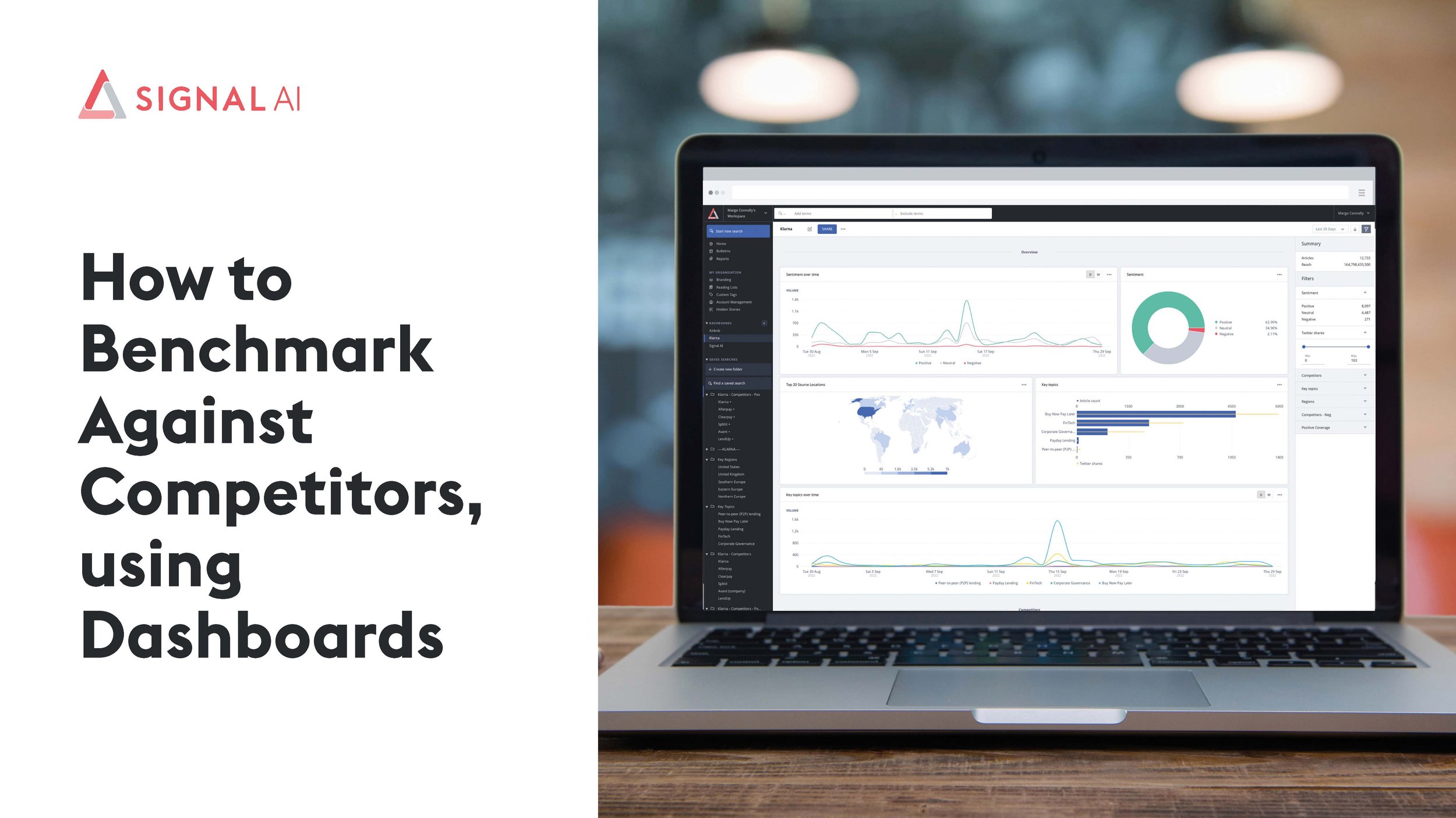
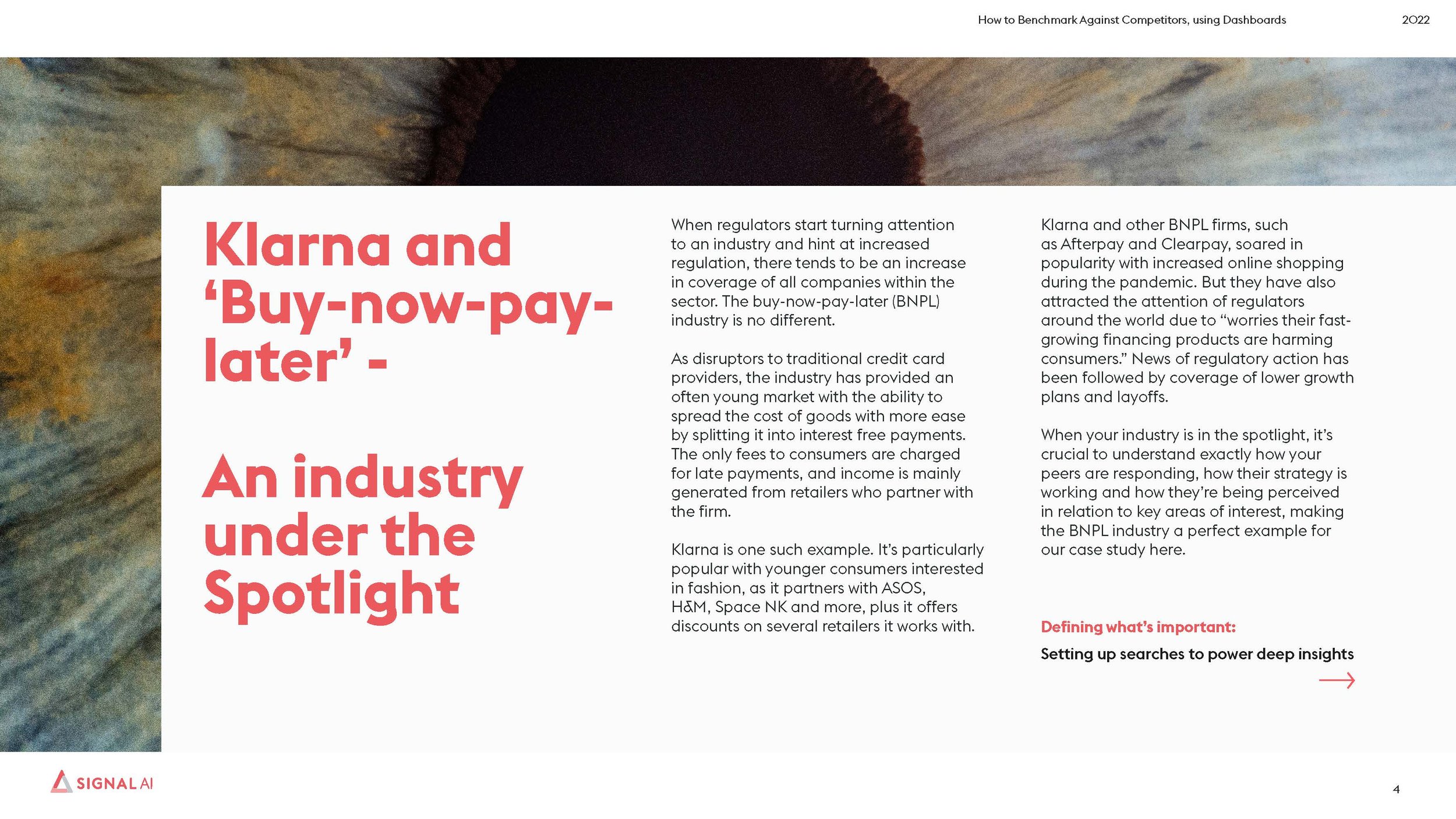
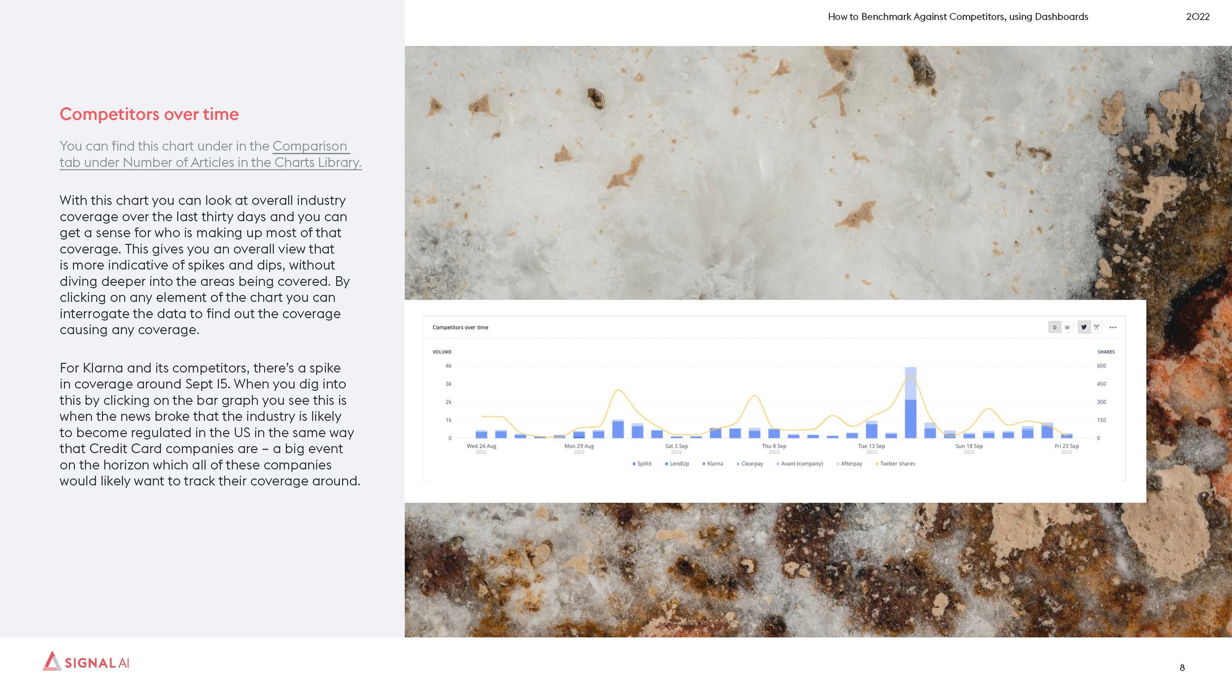
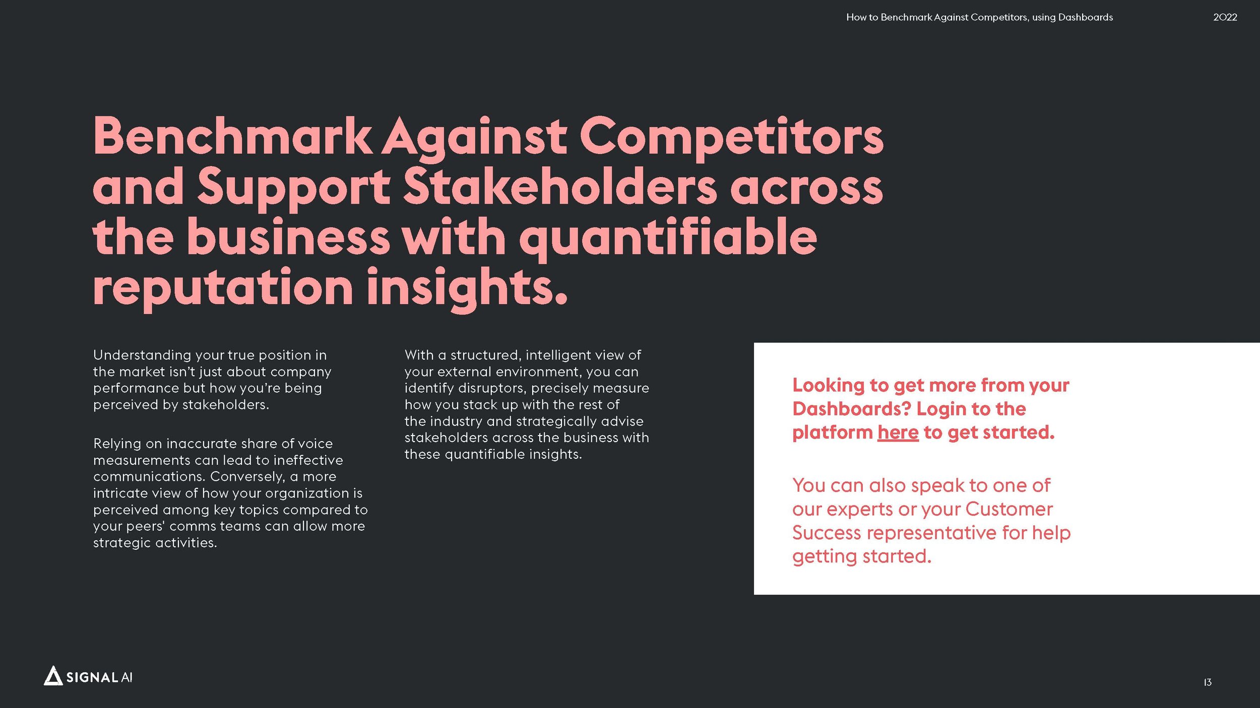
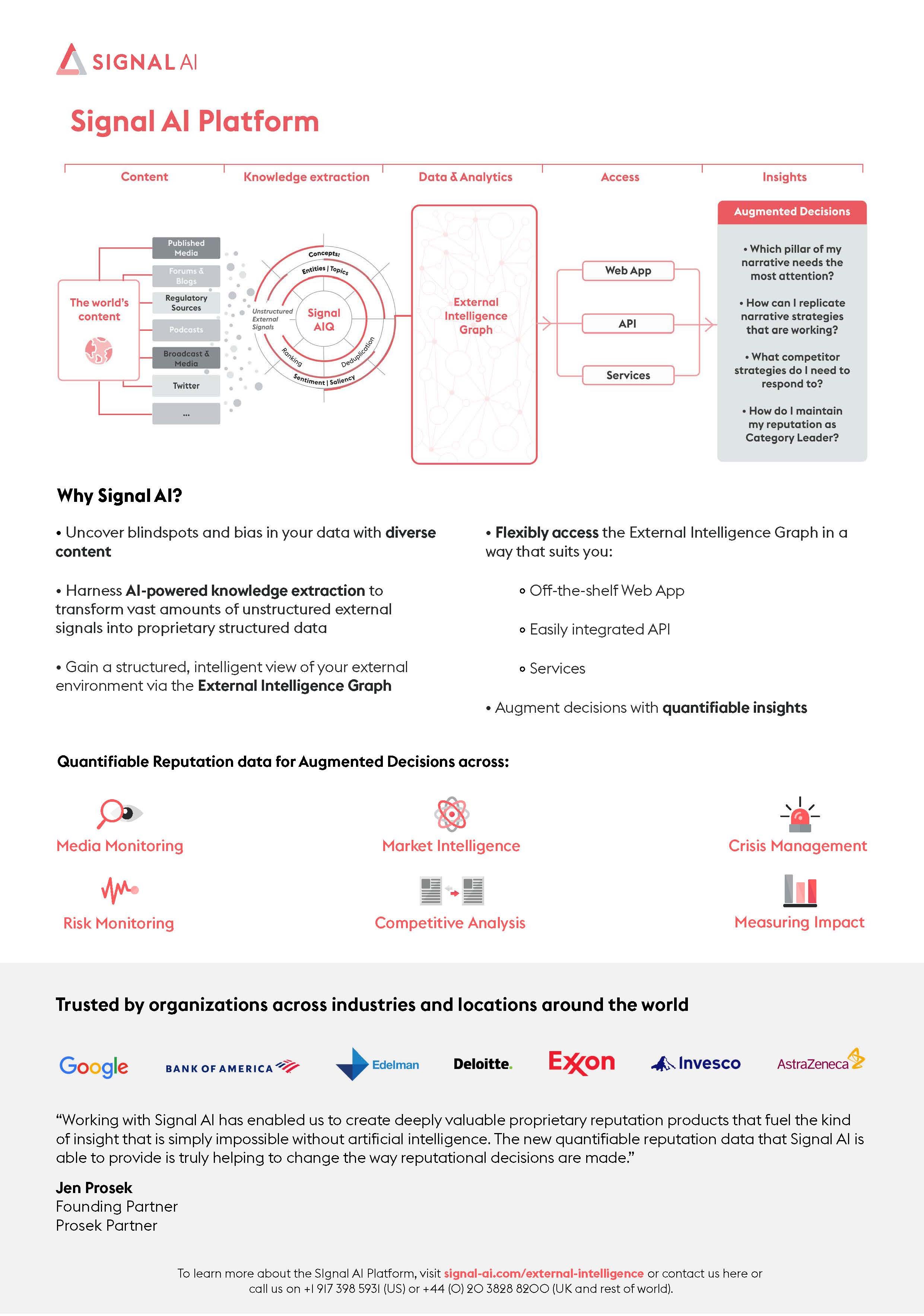
To move our branding forward and past the point of reports and collateral simply being informational, I made use of negative space and bold typography to allow reports such as the Dashboards Playbook and Cult Wines Case Study to be more of an experience when viewing the data we present. When the challenge of collateral being too content heavy and data focused arose, I made the most of visually interesting icons and sticking to a grid system to maintain continuity for instance within our One Pagers.


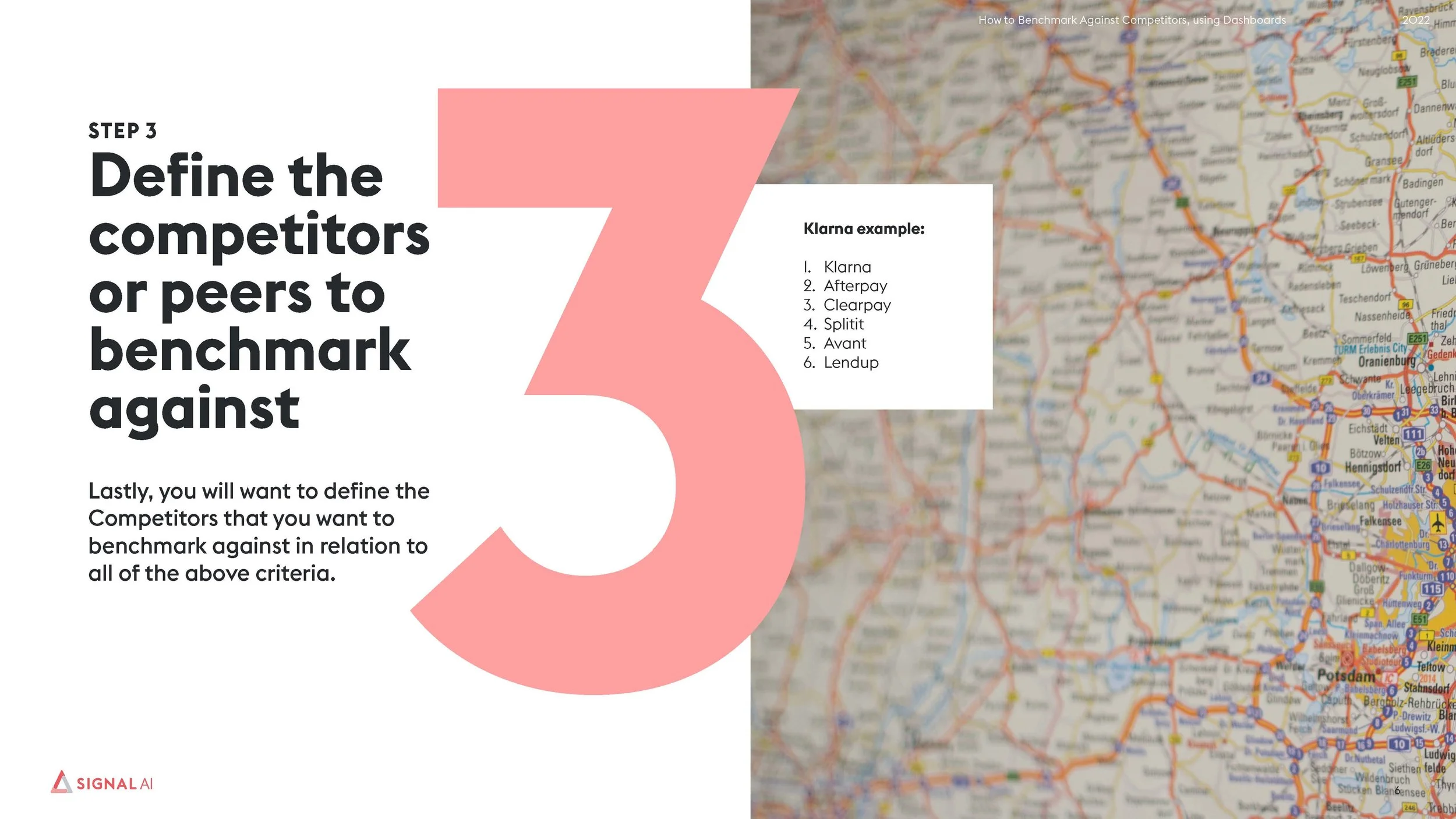
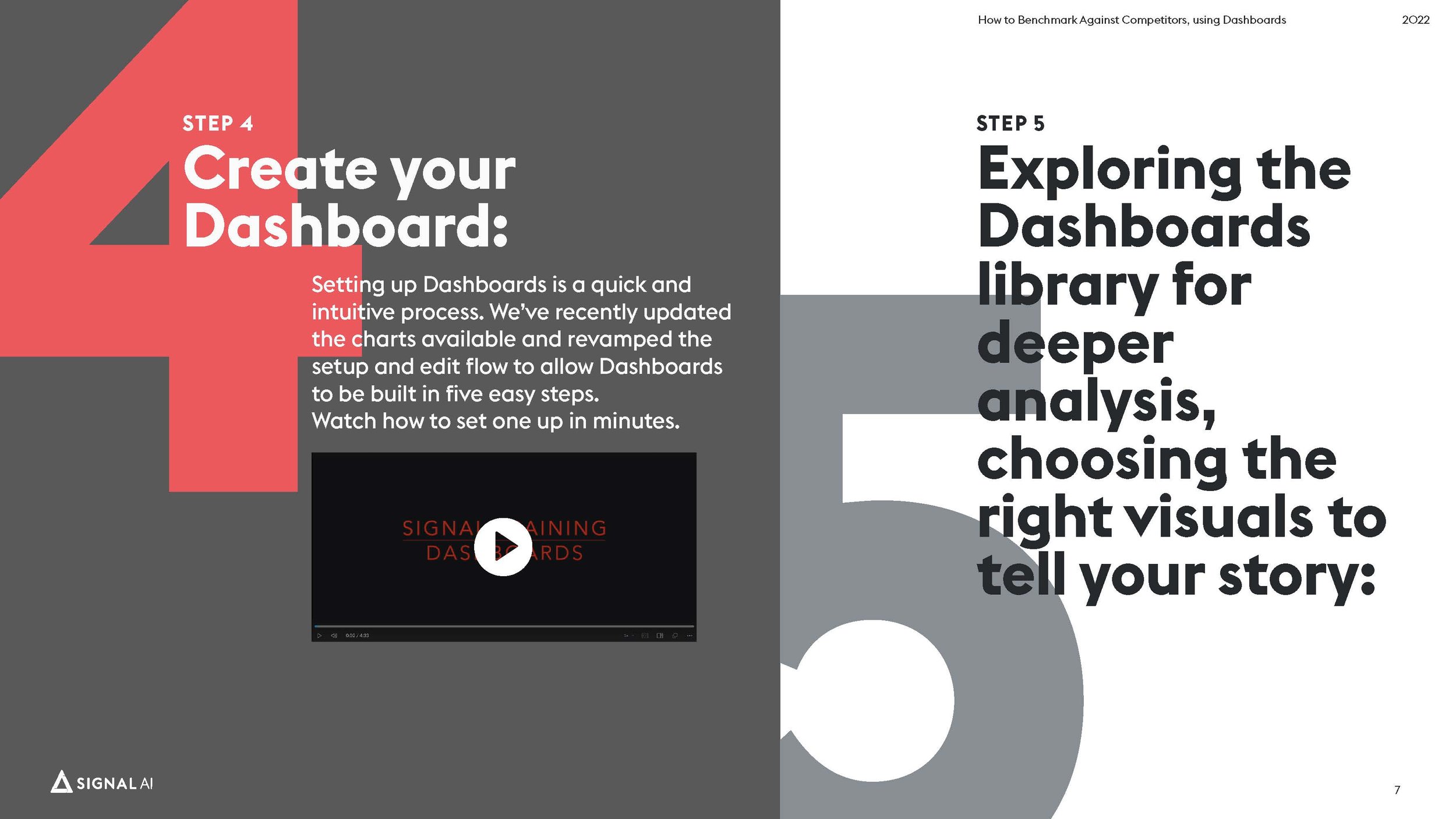

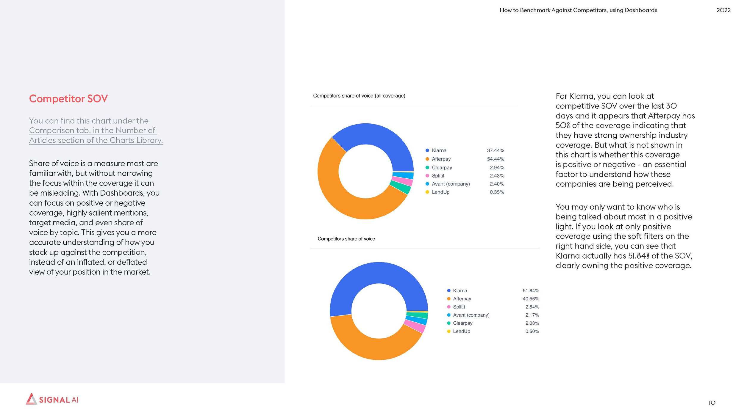
Dashboards Playbook

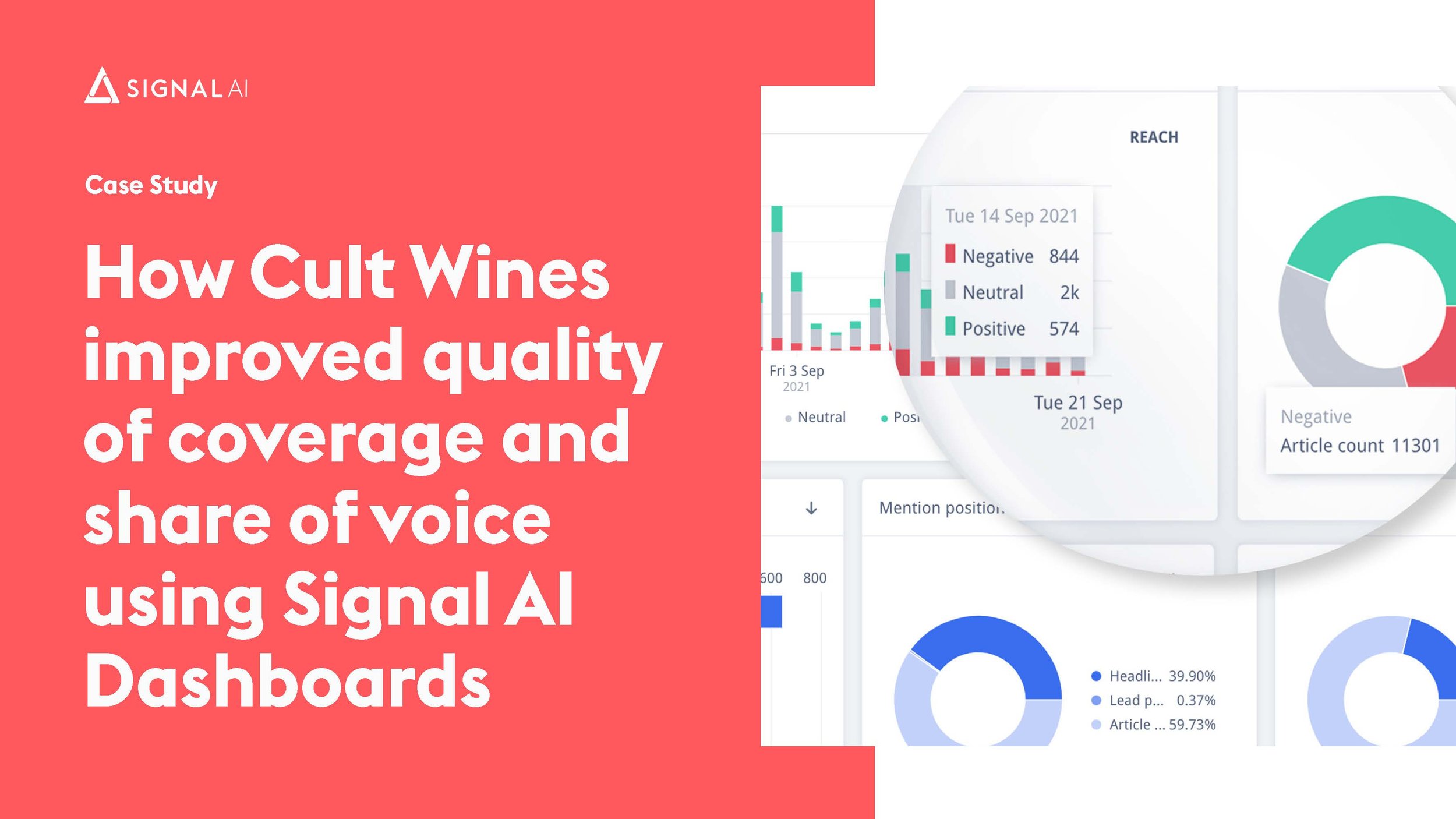
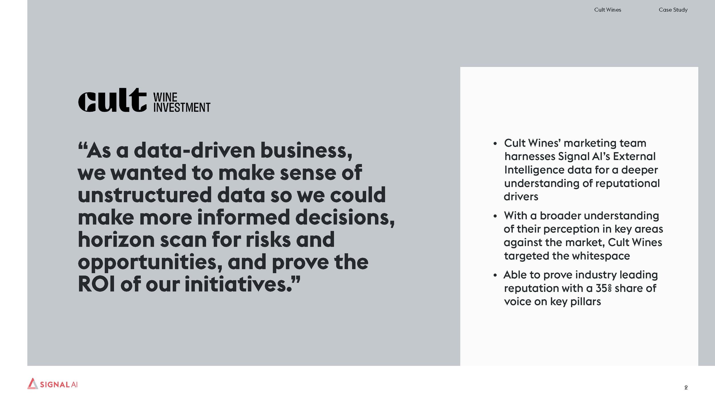
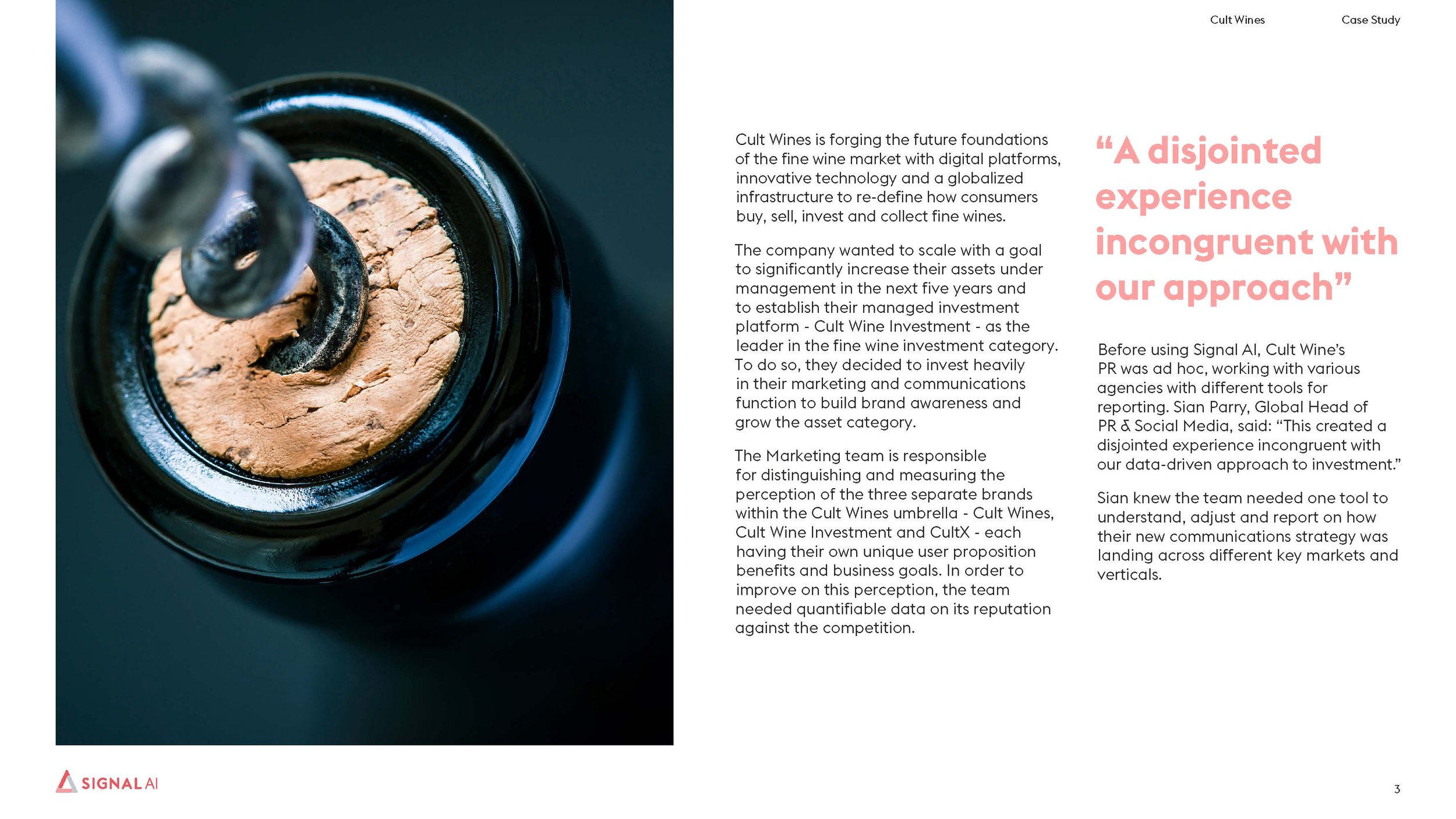
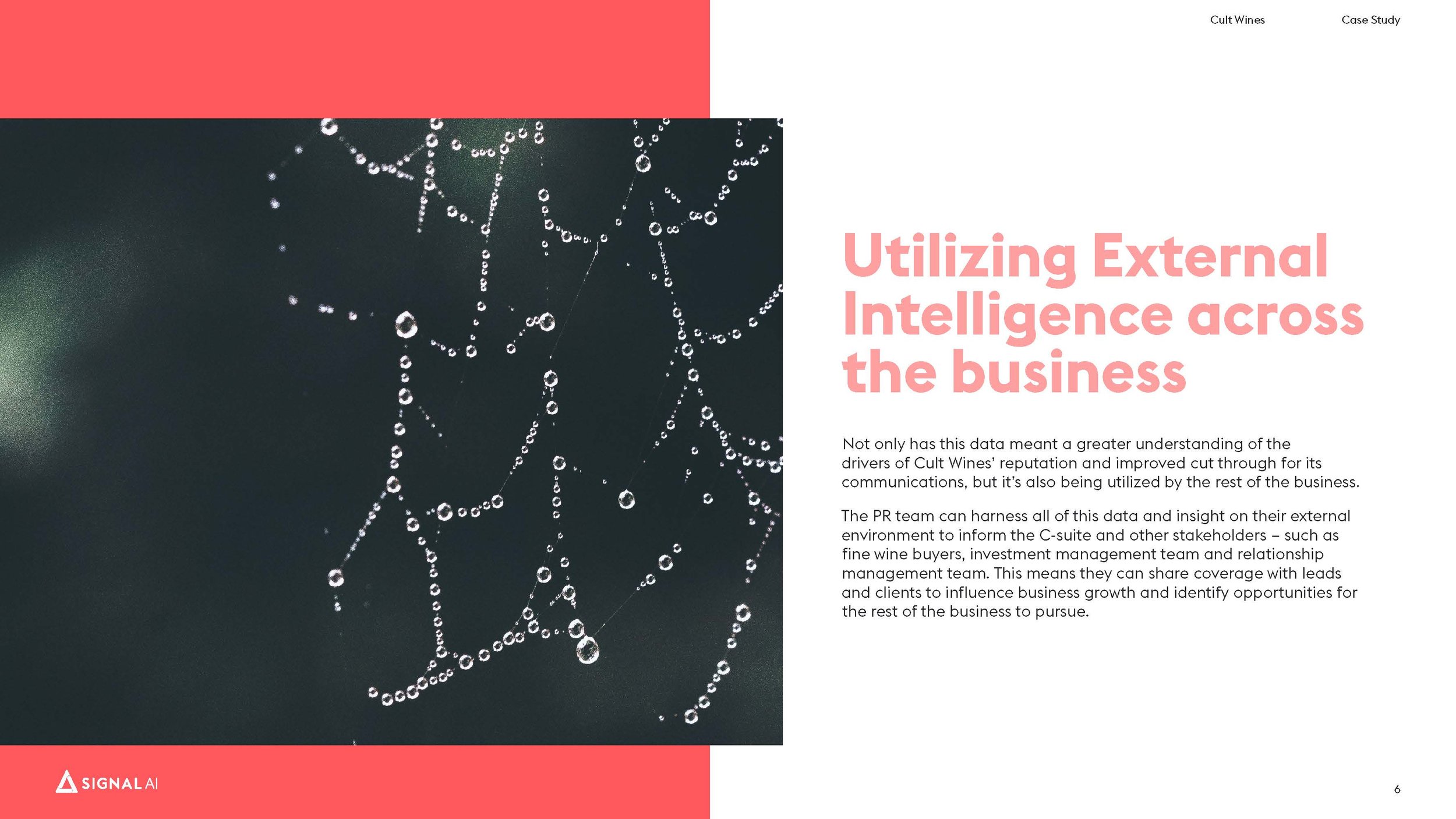

Cult Wines Case study
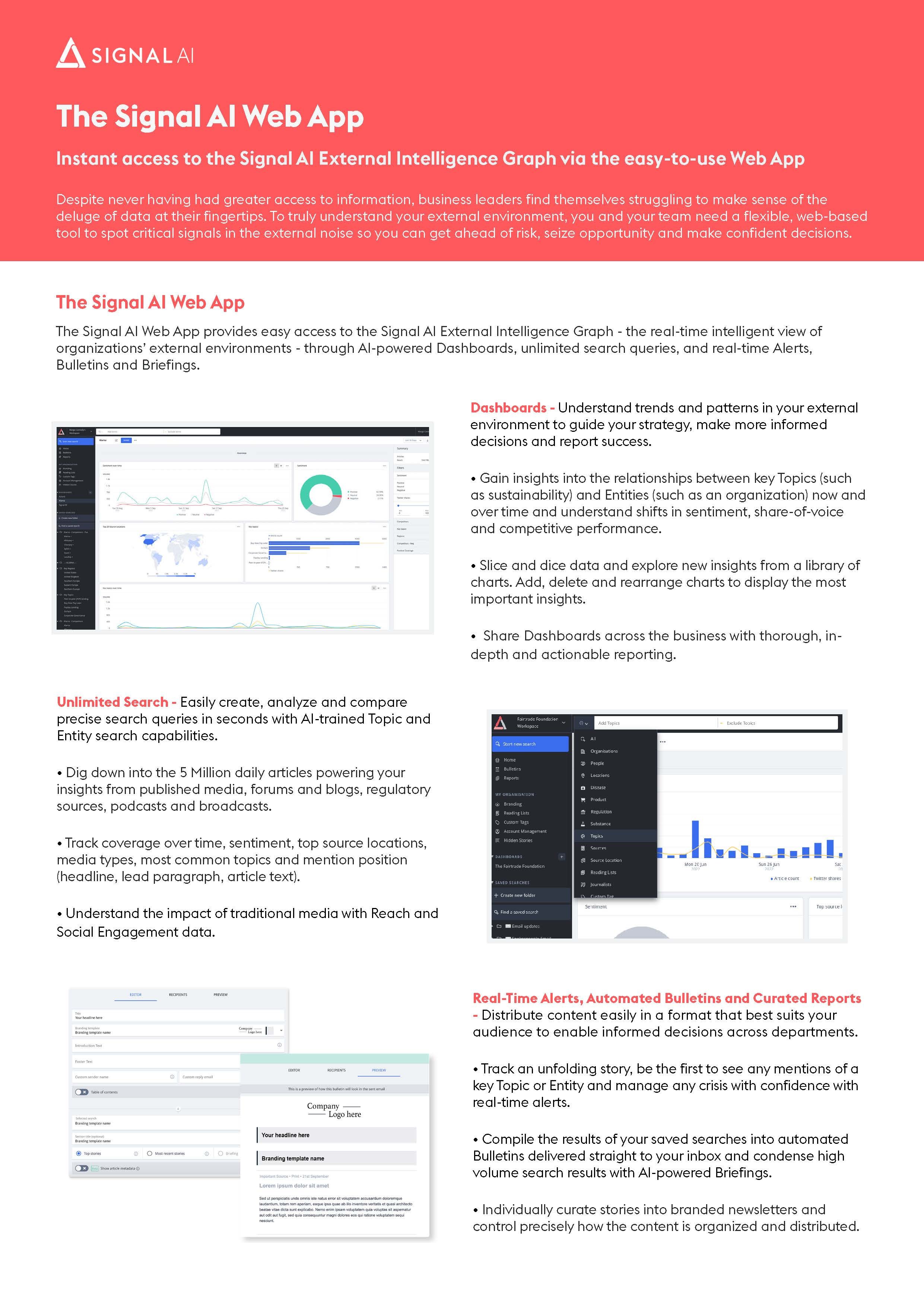
Web App One Pager
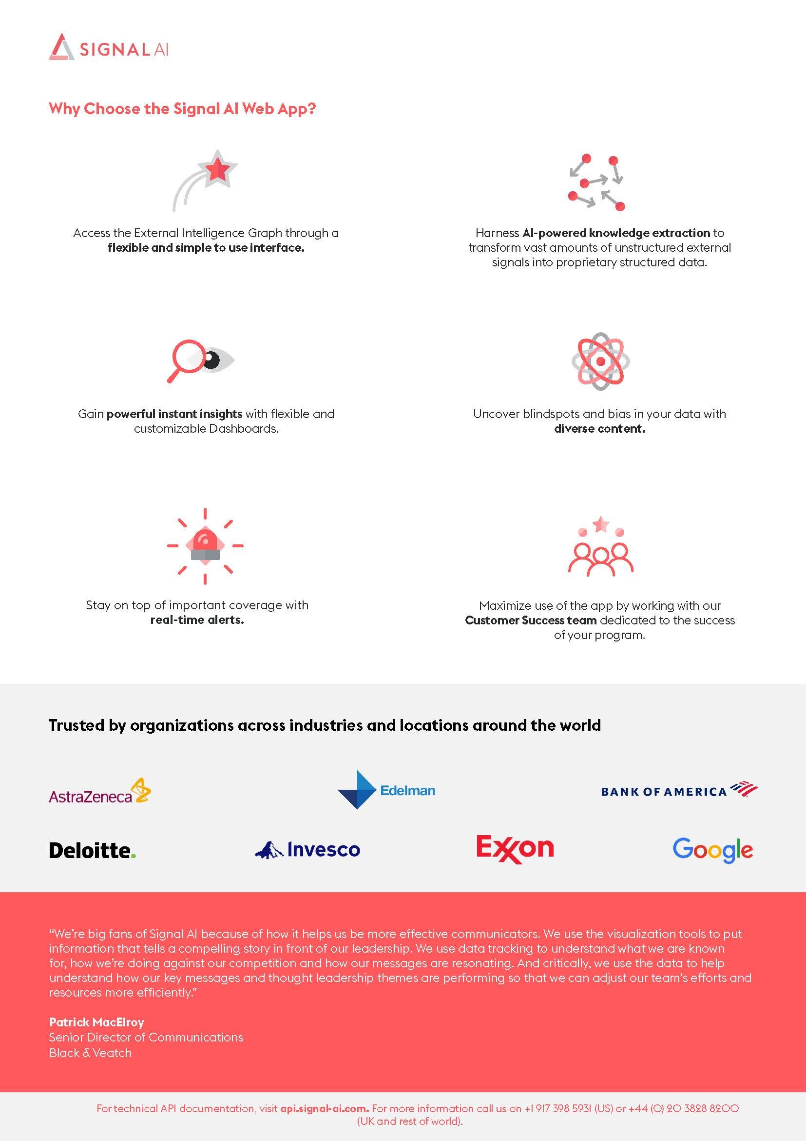
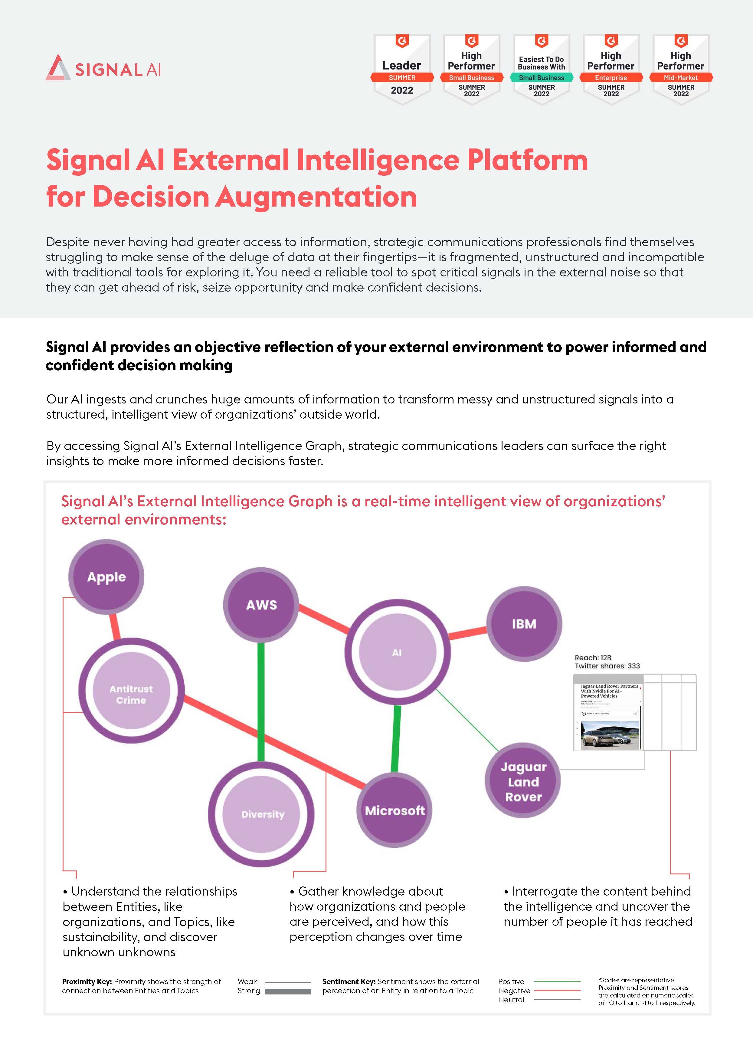
External Intelligence One Pager
Slide Deck Design
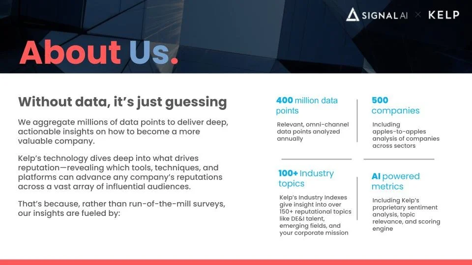
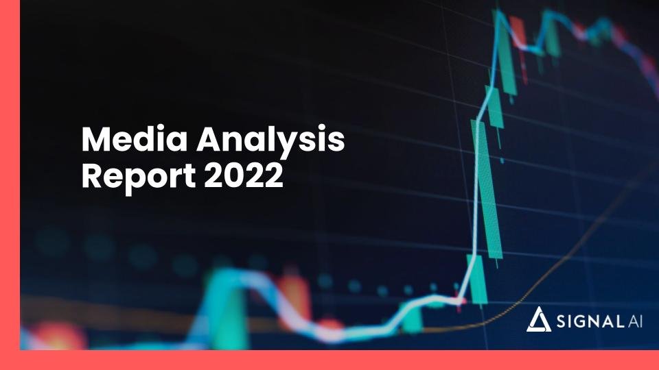
As deck work often ranges from presenting data to prospects and clients to announcing internal team updates, ensuring that the branding is always consistent but relevant to purpose is crucial. I maintained this balance by alternating composition styles and imagery as well as making the most of our primary and secondary colour palettes.
Signal AI X Kelp Evergreen Pitch


Media Analysis Report


Internal Demo Deck


PR in Travel ABTA Event deck


